About True: A Holistic Boutique
True is the sister store of Kismet, a local Denver boutique that, in addition to offering beautiful clothing, jewelry and accessories, also has a curated section of books on wellness and a selection of body care products. True’s main goal is to offer their clients a way to adorn themselves not only from the outside in, but also the inside out.
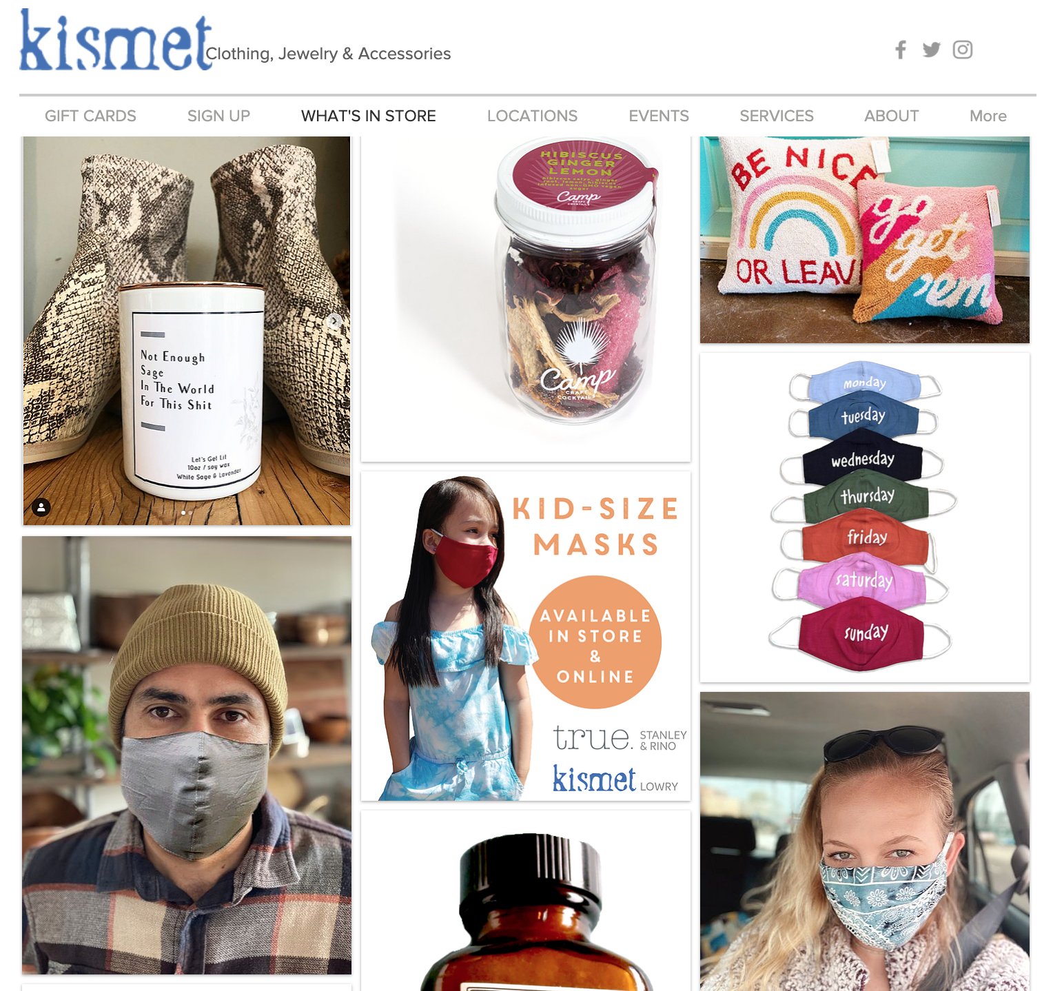
True: Holistic Boutique original homepage
The Challenge: To find an e-commerce site with questionable navigation, design, and usability and redesign it so that it would be more user friendly. I had originally chosen the website, Kismet, but quickly discovered that, while Kismet had varying issues, it’s sister site, True, was the actual product site and so my focus fell in that direction.
My role: UX Designer
Duration: 2 Weeks
Uncovering the Real Issues
This project that involved selecting and redesigning a website that had questionable navigation and usability.
When initially looking for an e-commerce site to work on, I found Kismet and decided to select it for it’s somewhat overwhelming content. It appeared to be the homepage of the brand but upon further investigation, I realized that Kismet did not actually have anything you could shop. All of the product was located on the sister site, True.
So, I headed over to the True website and found that it had some ambiguous branding, confusing filtering, and some overwhelming content (e.g. event listings). It also carried all of the product, some of which I found was unshoppable. So I decided to focus in on this portion of the shared sites for the project.
Pros
Nice Color
Good Alignment
Cons
Overwhelming Content
No merchandise actually sold on home page
Not the actual product site
Choosing a Persona
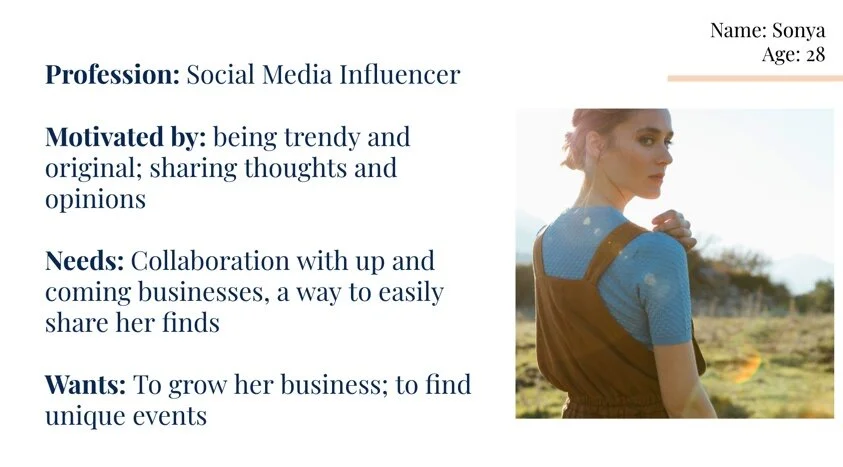
Once I had chosen a site that I wanted to reimagine, it was time to select a user persona from the list provided by my instructional team. I chose an Influencer persona. The goal was to repurpose the site with this target user in mind.
I felt strongly that True had something to say and that an Influencer persona would have as much to gain by collaborating with the business as the business did with the influencer. However, the influencer would not be likely to conduct business with the site the way it was.
What Does Sonya want?
To partner with stores that have unique products
To share thoughts and opinions easily
To attend unique events
The Problem
Influencers needs more features so that they can positively experience the brand and build their business.
Beginning Initial Research
Uncovering True’s main issues came in the form of several different research methods but I gained insights that would help me focus in on the iterations that needed to happen.
Heuristic Evaluation Insights
Categorization and navigation were difficult and confusing.
Card Sort Insights
Item categories needed more intuitive labeling.
Competitive Analysis Insights
Users need more ways to access product, promote the website, and experience events.
True did not have enough features to draw the influencer, our target customer.
Stepping into Design
In an effort to focus on creating new experiences for the user, rather than repairing existing ones, I created a future state user flow. This helped me to visualize and unlock new areas of customer interaction and value, to consider what was in my realm of possibility as I designed.
Furthermore, as navigation was one of the main issues with the True website, I took the time to draw out a new navigation scheme, making sure all navigation was seamless and simple for the user.
Following these initial research methods, I felt comfortable enough to start designing a solution for my influencer. A minimal paper prototype was created and briefly tested to get initial feedback on my design thoughts. I didn’t focus here, however, and quickly moved into my low fidelity design and testing.
Low Fidelity Usability Tests show there is work to yet do…
Using sketches and grayscale prototypes, I began redesigning the site:
Made social media buttons highly visible so that the Influencer would be reminded and encouraged to promote
Rename product categories and filters
Provided more ways to shop product
Creating an “Influencer Hub” where my target user could partner with the store and find relevant info
When in usability tests, however, there were more issues than I realized:
Checkout process too complicated and too long
Navigation flows were unclear
Visual elements were distracting and left much to be desired
Filtering options were unclear and hard to read
High Fidelity Prototype
So I went back to the drawing board to make changes. When I first rolled out my high- fidelity prototype, I tried to keep the clean and structured format of the brand but I added some features out front like the featured items and events calendar. One other feature I tried to maintain was a single payment page, thinking that it would be more efficient and convenient to the user.


Usability Testing proves daunting yet again….
To define usability when doing the high fidelity tests, I
Sought to discover if a user could easily follow the process to make a purchase and could quickly locate events.
Wanted to see if the user could understand the navigation systems present.
Needed to know if the product was engaging and encouraged further customer use.
What I discovered….
Users liked the clean, earthy vibe and easy navigation but were confused about what the site sold or promoted.
Most users intuitively looked for a home button and not having one meant more time on the site.
User struggled to differentiate between an “add to bag” and “buy it now” button.
Having all the payment steps on one page created confusion; users intuitively searched for clear steps to be taken.
Events calendar was not clear enough and was hard to read.
Final Changes…
With renewed purpose, I moved toward making changes one more time.
Added a home button to the top left screen.
Fixed breadcrumbs and payment filters to be consistently aligned.
Revised the payment options page to be more intuitive.
Added a color scheme and shapes that may be more engaging to the user.
What’s Next?
Though the page is done for the purposes of this project, there are still things I want to accomplish here in the future:
Research on Influencer needs/wants
Consider how to pair the sister sites more intuitively
Build out the Influencer Hub
Add Express Checkout options
Review and fix alignment issues
Complete footer information
Rework the visual design elements to make more engaging
Retest Hi-Fi usability
Final Thoughts
True: A holistic Boutique has a lot to offer the local fashion industry and the redesign of their website would hopefully bring about a more robust clientele and business output. As my first e-commerce project, I found that I learned the most about navigation and branding. Small things are key and something as simple as the placement of a hero image or a filter tab can change the experience of the user. I am eager to use what I’ve learned in completing this project as well as into my future projects.
Thank you for reading about my work!


