
the brief
Our task was to create a more personalized experience or ordering samples in order to help customers make better informed decisions about their body care products.
the research
In a time where human contact is so limited and impersonal, consumers need to feel engaged now more than ever. We needed to find out what was already being provided to give consumers this engagement so we began doing research.
Screener Survey
The screener survey allowed us to find the most fitting consumers to invite to interviews. However, the screener also left us asking if this product was for more than women of color as the brief originally implied.
Competitive and Comparative Analysis
Our C&C analysis gave us a better understanding of the industry and provided some context for our process moving forward. By understanding these facets of competitors’ products, we could design a solution that was informed and made for a superior experience.
User Interviews
Wanting to discover the needs and behaviors of our target users surrounding their experience of body care products and the sampling of those products, we headed into interviews with our selected interviewees.
the research conclusions
Users felt online sampling would help create a more personalized experience.
They wanted the feeling they would get being in the actual store
They would be open to purchasing online if they could receive solid customer service, quick delivery, and accurate recommendations
And they prioritized being able to smell the product and feel its texture before purchasing

the first prototype
Feeling certain that we had many ways to give a more tailored experience on the Spraise website, we set about creating a low-fidelity prototype.
Our initial designs allowed users to select samples from all product lines that Spraise carried but we were met with a challenge following a meeting with our client: she only had one product to sample.
back to the drawing board
With this new info, we took a moment to recalculate and explored our options on how to proceed. This led us to make a decision to continue with a current state prototype (one that Spraise would be able to implement now) and a future state prototype (one that Spraise would be able to implement later on with the expansion of available samples).

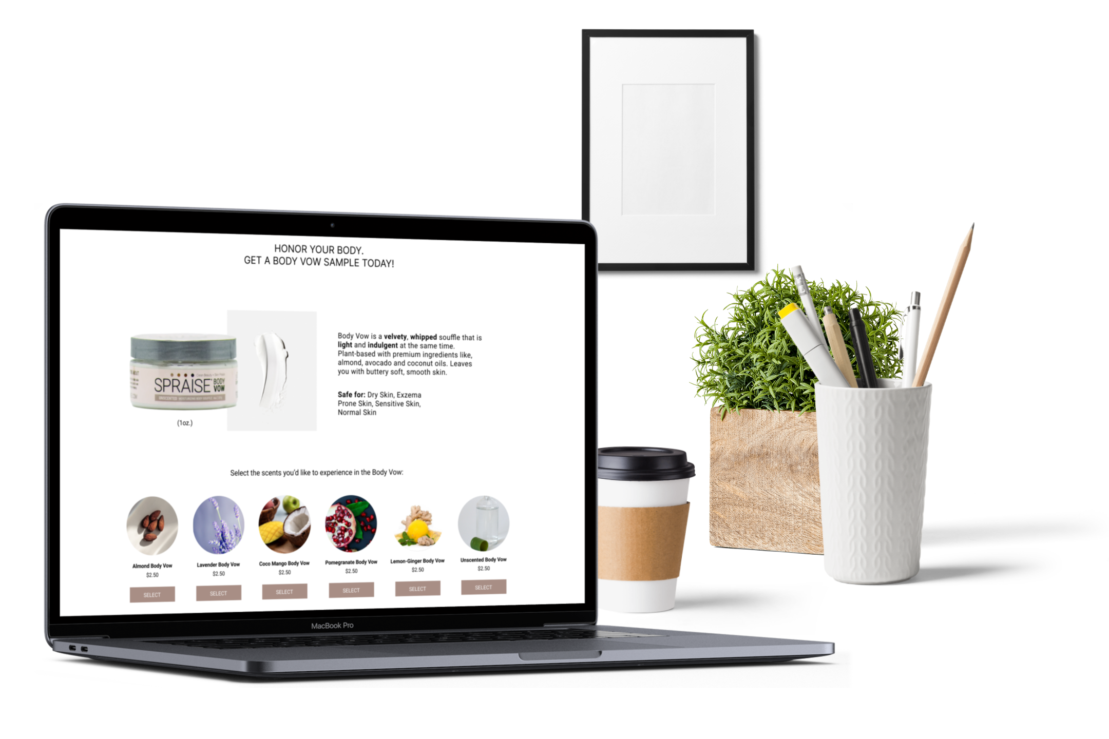
Current State
Users can view description for ingredients and textures as well as visual representations of the scents
From there, they would select the Body Vow and choose several scent options with visual representations before reaching the checkout page
They would be able to add samples from a cart popup at the end of the purchase process for the regular sized products

Future State
Users begin by selecting from one or more products they would be interested in sampling.
They would also have the ability to read a short description by hovering over the icons before selection.
Users are then able to choose one or more desired scents from the presented option
Then they would then proceed to a page in which the filtered samples can be added to their cart in one click
usability testing proves to be confusing
When we went into usability testing on our low fidelity designs, we found that , though customers were happy about adding a sample to their bag from their cart, they were consistently confused about several other things:
Limited samples: “If I’m paying, why can’t I have the number of samples I want?”
Navigating the bundling process
Cost of samples
two prototypes too many
We knew we had a few iterations to do to get to a high-fidelity level but we soon realized that working on 2-3 separate prototypes would make things difficult for a client and for developers. Instead of thinking that we were creating two products for you, one to use now and one to use later, we discovered that we needed to create one product that had multiple variations.
going modular
We needed to design something modular, breaking down the design into smaller, exchangeable sections that can be customized according to business needs. A modular template would allow our client and developer more efficiency and ease as the company grew and updated products or changed out inventory.

Single Sample Home Page
Body Vow Module

Body Scrub Module

Add Sample from Cart
After vigorous debate, we found a way to integrate our many prototypes to provide for a seamless and efficient design.
A shared home page with flows leading you to a single product sample or to many depending on Spraise needs was created.
The options to add samples to customer carts was common to all scenarios Spraise might encounter.
Visuals and language were replaced to eliminate confusion and fully reflect each scent profile, while price information was more transparent and efficiently placed.
final rounds of testing
High-Fidelity usability testing proved a success overall but there were still some questions about being able to purchase as many samples as desired when paying and some navigational questions (creating a navigation bar at the top of every page, including the samples in the menu area, etc). Users also struggled with the language of “Add to Bag” during the sample selection process. They felt more comfortable selecting the sample immediately and then adding them to the bag at the end of the process.
final iterations
Our final changes following usability testing included making copy more fun and approachable, changing the selection vs “add to bag” language, adding pricing information in closer proximity to products.
In the multiple products version, we also added a floating button so users could see how many items they had selected. We included a navigation bar at the top of the page and changed sizing information in the cart.