

Meet Artsy
Artsy features the world’s leading galleries, museum collections, foundations, artist estates, art fairs, and benefit auctions, all in one place. Ever growing, the site is used by art lovers, museum-goers, patrons, collectors, students, and educators to discover, learn about, and collect art.
The Challenge
My team and I were asked to help Artsy re-establish itself as the future of global art transactions. Artsy had noticed a trend in art flipping among millennials and wanted to capitalize on it by building a novel mobile app introducing younger users to purchasing art as an investment.
My Role
Role: Project Manager, UX Designer
Duration: 2 weeks
Skills
Product research
Prototyping
User research
Cross-functional collaboration
Design project management
Communication skills
Exploring Artsy
Before we began our project, my team and I needed to take some time to see what Artsy was about and what the site offered. We needed to take an inventory of the areas that might cause issue down the line. We discovered the following:
Vast selection but difficult for viewers to navigate
Search functionality and filtering unclear
Branding not distinct or clear
Questionable adherence to information hierarchy
Disjointed overall experience
The Bottom Line
The application wasn’t a space where the potential art investor or viewer would be captivated and drawn to stay.

Getting Started
Based upon recent art trends, Artsy was primarily focused on encouraging a new and younger demographic to consider art as an investment. They needed a visual refresh, greater engagement with their content, and a way to help users consider their options for owning and collecting art.

Our High-Level Goals
Discover the barriers Artsy had to drawing possible investors
Provide a space where users could engage with art
Offer relevant and personalized art browsing features
Provide information on how a user might invest in art
Discovering Our Target Users
From the beginning, we knew that one of the biggest challenges for this project was going to be scope. There were many directions our team could see it going and the possibilities vast. We knew that we had to get a better read on what users wanted in terms of art and who our target users would be. We started with a survey on Google Forms to identify art needs and discover opportunities for our application.

Users liked art but did not feel they could engage with it, let alone invest in it.
Finding a Way Forward
Heuristic Evaluation
Following our survey, we completed a Heuristic Evaluation on the Artsy site. In this evaluation, we made a checklist of all the features contained in the original Artsy sight in order to gain insights that could help us enhance product usability from early in development.
Insights
Information and Content is overwhelming
Information and Content is not well organized
Brand is unclear; all we know is that you have lots of art
Visual appearance feels outdated
Competitive Analysis
We also completed a Competitive analysis, researching across different competitor applications to discover patterns and catalog offerings to their users.
Insights
Payment plans would help users to buy more
Having a personalized way to shop would be an advantage
A Visual Search feature could incorporate The Artsy Art Genome
Initial Interviews
Finally, we conducted remote interviews with several potential users to better understand their needs and wants regarding Artsy. With those evaluations in hand, we knew then what our platform contained and what it still needed, we were able to make an informed start into our problem.
Insights
Users want a way to engage more easily with art and the artist
Users weren’t opposed to investing in art but didn’t feel they knew enough about it to do so
Based on our brief, initial surveys, interviews and analyses, we started began the project in earnest, keeping in mind a young professional who wanted to diversify her investments.

Creating a Personalized Experience

Using a plethora of low-fidelity iterations, we attempted to create a way for users to search for art by incorporating Artsy’s Art Genome project, the algorithm that classifies art by certain features such as color, medium, era, etc. Incorporating this algorithm allowed users to personalize their viewing experience and give the user recommendations of art they might enjoy.
Embracing the Pivot
We had positive responses in Usability Testing but some features raised further questions.
What is the purpose?
How does this app solve our problem?
How can we engage users further?
What do users really want?

They just wanted to engage with art!
While users were interested in the idea of art appreciating over time, they were more interested in just learning about art and engaging with the pieces and artists.
The real problem was that our users were not knowledgeable enough about art to make art purchases for themselves, let alone to invest in it!
A New Persona Emerges

With a new persona in mind to guide our designs, we headed into our high-fidelity prototyping with a new purpose.
We decided to lean away from investment as a focus.
We also decided to lean into the personalization as a way to break down the barriers of engagement with art.
Usability Testing proved we had more work to do.
We went into our high-fidelity usability testing with confidence and a well-redesigned prototype. All our changes made for a clean aesthetic and an engaging experience…..or so we thought.
Through testing, we discovered the following:
Non-working navigation buttons
Inconsistent design formatting
Confusing language in our navigation

Pivoting Again
Our prototype still wasn’t solving the problem: providing an easy way to engage with art.
We returned to our high-fidelity prototype to make iterations:
Reorganized the item detail and purchase page
Redesigning the “browsing” feature to create a more personalized experience
Another competitive analysis of curated content sites like Reddit and Pinterest
Redesigned the search option to incorporate the users’ previous preferences
Optimized the onboarding experience and removed language that the users found confusing

Art Preference Selection

Visual Preference Selection

Personalized Home Page
What we were left with was a simplified experience. Clean design, simple UI, and a clear purpose: create a way for users to engage with and learn about art.

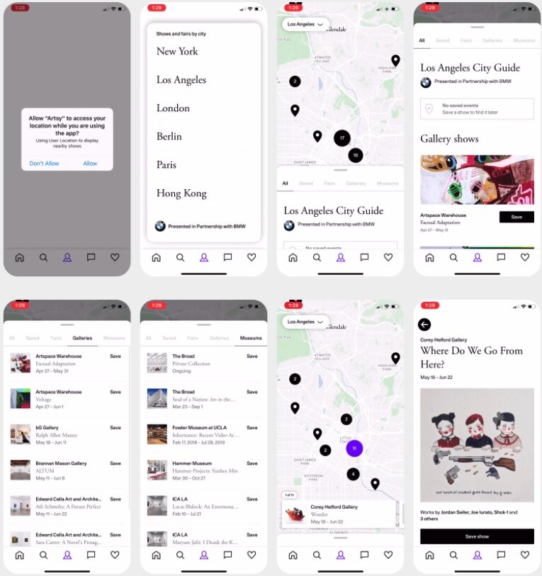
ARTSY PROTOTYPE
Final Thoughts
It seemed that with every round of research and testing in this project, we were challenged to swivel in our thinking and return to user insights and commentaries. But through this, we came to understand that, while Artsy wanted investment at the forefront of users’ minds, millennials were looking for something else. They just want art to be financially and intellectually accessible. This project was a reminder to us that the best laid plans in design boil down to the needs and wants of the users we design for.
In future iterations, I would like to continue exploring and developing the following:
Augmented Reality viewing features
Virtual Reality Gallery Tours
Live auctions from within the app
Payment plan options
Gallery and Artist Collaboration
Artsy’s Art Advisory
Fractional Ownership of Art